Back to components

setup-checklist

Stallwise

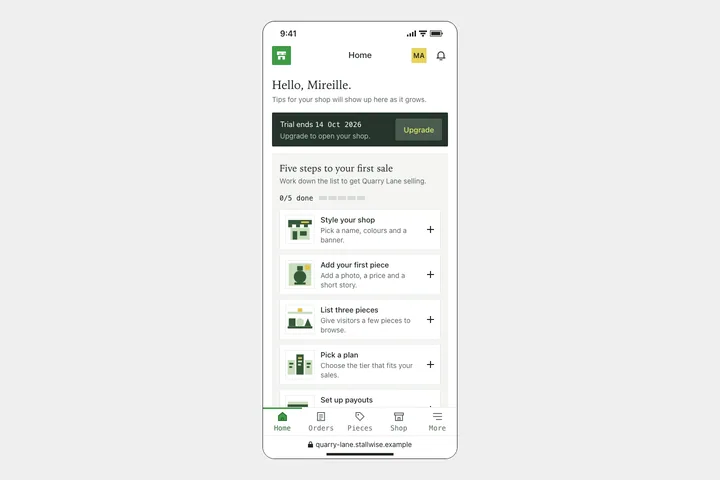
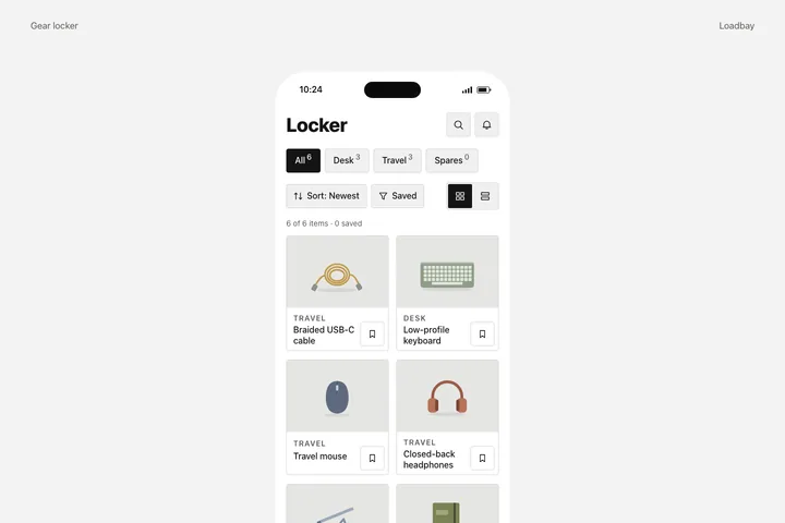
A first-run home screen for a fictional storefront builder for small makers, shown at phone scale: a 390px phone with a 1px near-black outline and 24px corners centred on a light grey canvas, holding a decorative status bar, a top bar with a square green app mark, a centred screen title, a square monogram and a bell, a serif welcome heading, a dark forest-green trial banner with a monospace date and a lime action, and a grey setup panel with a serif title, a monospace n/5 counter, a five-segment block meter and five white task cards with flat two-tone illustrations and plus signs, the fifth card cut off by a tab bar with monospace labels above a decorative address bar.

Integration

Use the complete component.

Every file is included. Choose a framework to see its setup instructions.
Source & design

Built from a documented study.

Loading the design brief…

For coding agents

Use the public alpha API

The public alpha exposes read-only component APIs and exact versioned downloads. A hosted MCP endpoint is not available yet.

GET /api/components
GET /api/components/:id
GET /api/components/:id/versions/:version/artifacts/:framework

Read-only public alpha · API and downloads available