Hatchline
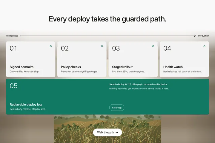
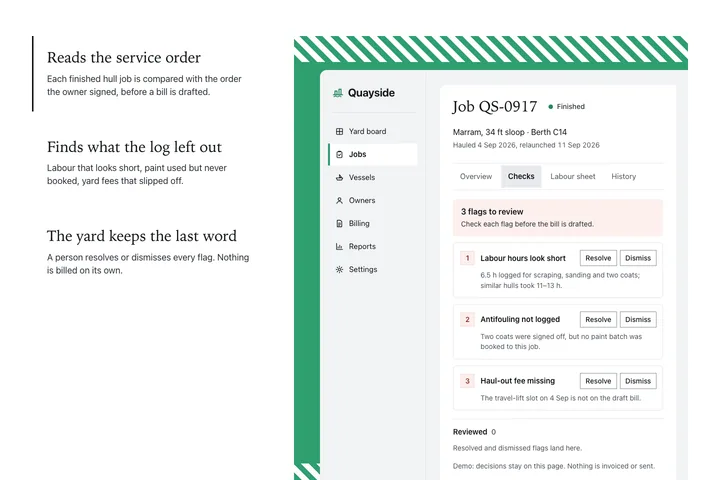
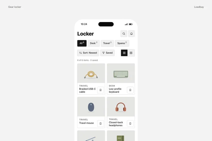
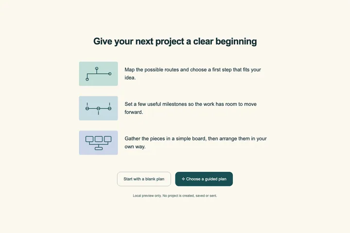
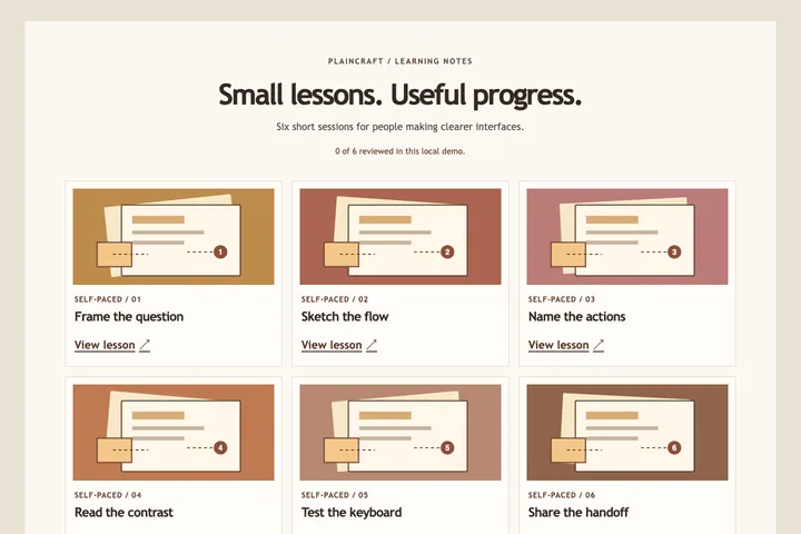
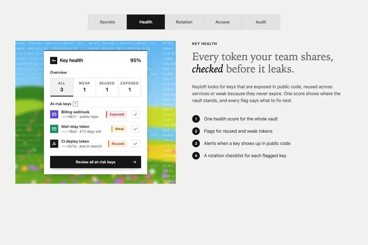
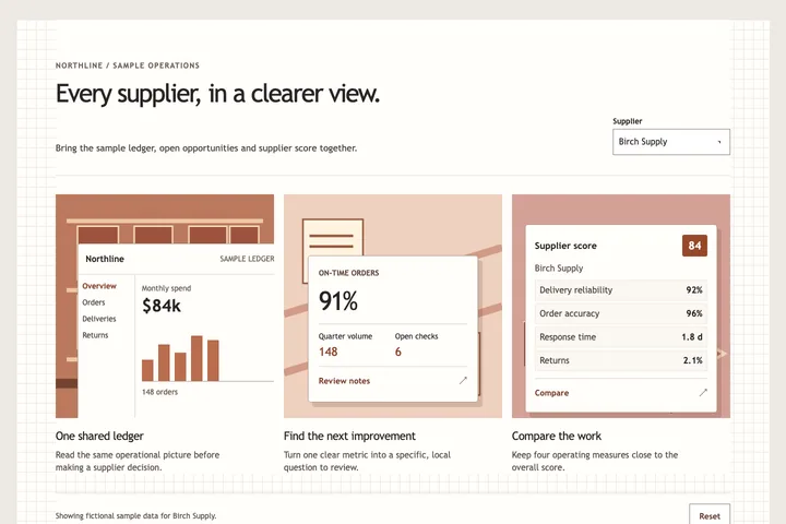
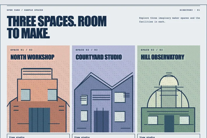
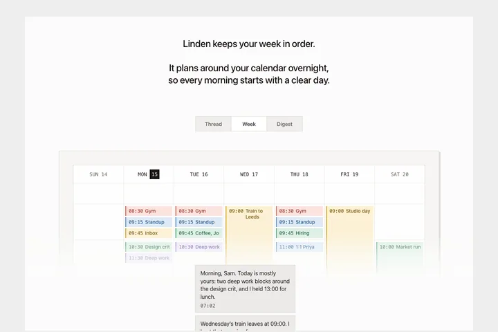
An assurance row for Hatchline, a fictional CI and build-infrastructure vendor: on a full-bleed mid-blue field with large soft lighter blobs, one centred row of four equal cream portrait cards. Each card has a 28px navy icon disc and a monospace '01 / 04' index, a serif title, a one-line grey sans claim and a small Details disclosure, above an inset multi-colour inline SVG scene shaded with halftone dots; Details opens two plain evidence lines and an 'available on request' note inside the card.