Back to components

recommendation-card

Loadbay Daily

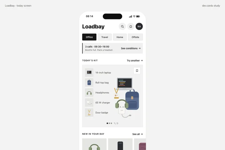
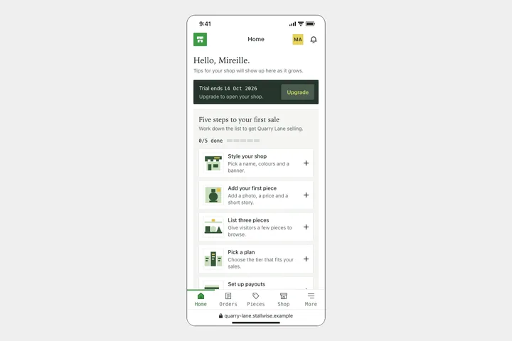
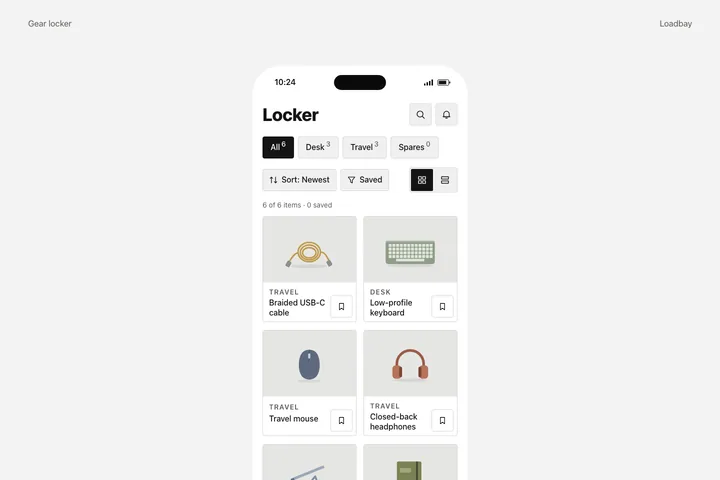
A "today" screen of a fictional kit-suggestion app for developers, shown as a centred phone on a pale canvas with two captions: a heavy sans title with two round icon buttons and an initials avatar, a row of square bordered context chips, a flat conditions strip with a left rule and a text-only link, then a square hairline kit card that shows one suggested kit twice — as a list of five square tiles with names and as an overlapping arrangement of the same five original illustrations — with a square bookmark toggle and a "1 / 3" counter with square ticks, a cropped sideways row of recently added items and a full-width text tab bar. Choosing a context swaps the conditions and kits, the cycle action steps through the kits, and every panel says the data is local sample data.

Integration

Use the complete component.

Every file is included. Choose a framework to see its setup instructions.
Source & design

Built from a documented study.

Loading the design brief…

For coding agents

Use the public alpha API

The public alpha exposes read-only component APIs and exact versioned downloads. A hosted MCP endpoint is not available yet.

GET /api/components
GET /api/components/:id
GET /api/components/:id/versions/:version/artifacts/:framework

Read-only public alpha · API and downloads available