Back to components

approval-card

Pennant

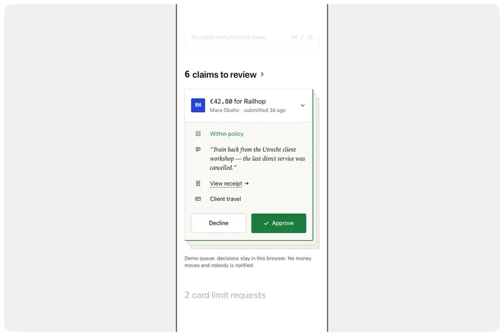
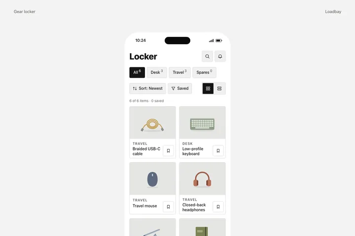
An in-product reimbursement approval for a fictional team-spend product: a large phone-screen crop on a light grey rounded canvas, a faded previous card above and a faded next section below, a count-and-chevron heading, one expanded claim card with a square monogram tile, a monospace amount-for-merchant line, a grey submitter-and-age line and a chevron over a rule, four glyph-led rows (a green in-policy status, an italic serif quoted note, a dotted-underline receipt link and a category) and two equal decision buttons, outlined Decline left and solid green Approve right, over two hard-edged outlined layers offset down and to the right.

Integration

Use the complete component.

Every file is included. Choose a framework to see its setup instructions.
Source & design

Built from a documented study.

Loading the design brief…

For coding agents

Use the public alpha API

The public alpha exposes read-only component APIs and exact versioned downloads. A hosted MCP endpoint is not available yet.

GET /api/components
GET /api/components/:id
GET /api/components/:id/versions/:version/artifacts/:framework

Read-only public alpha · API and downloads available