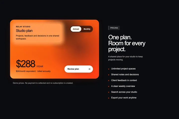
Relay Studio
A dark pricing section with one vivid orange offer card, clear billing choices and a working local plan review.
Free tool
Describe the component you need in four choices and get a precise build prompt for v0, Lovable or Cursor: layout, copy, colour tokens, states, accessibility and responsive rules, written the way dev.cards documents its own components.
Build a pricing section for Plotwell, a fictional project planning tool for small agencies.

## Overview
A pricing section for Plotwell, a fictional project planning tool for small agencies: a centred eyebrow, two-line heading and one-line intro above a monthly/annual billing switch and three equal plan cards in one row, the middle card filled with the accent as the recommended plan; each card stacks a plan name, a large price with its billing unit, a one-line fit statement, a full-width action and a short checklist, with one quiet honesty note below the row.

## Layout and composition
- Centred header block, max width about 640px: eyebrow “Pricing”, a two-line heading, one sentence of intro.
- Billing switch directly under the header, centred, with “Annual” carrying a small “2 months free” badge.
- Three plan cards of equal width and equal height in one row (max content width about 1120px, 24px gaps); the middle card is the recommended plan, filled with the accent and carrying a “Recommended” label.
- Inside each card, top to bottom: plan name, price (large, tabular figures) with the billing unit beside it, one-line fit statement, full-width action button, a divider, then four or five checklist items.
- One centred note under the cards in the muted colour.

## Content (realistic demo copy, no lorem ipsum)
- Plans: Solo — Free — “For one planner trying it out”; Studio — €14 per seat / month — “For teams up to 25 people”; Agency — €29 per seat / month — “For several client teams”.
- Annual prices are ten times the monthly price, shown per month with “billed annually” underneath.
- Checklist items drawn from: “Drag-and-drop timelines”, “Client-ready status pages”, “Workload heatmap per person”, “Time tracking without timers”; higher plans repeat the lower plan’s items as “Everything in Solo, plus”.
- Note: “Demo prices. No payment is taken and no account is created.”
- Plotwell is fictional. Write for agency leads and project managers; do not mention real companies, real people or real customer logos.

## Visual style
- Style: minimal, light theme.
- Typography: one neutral sans-serif (the system UI stack), headings at weight 600 with slightly tight tracking (−0.02em), body at 15–16px with 1.55 line height, labels at 12–13px.
- Shape: 8px radius on cards and inputs, 6px on buttons; no pill shapes.
- Surfaces: flat surfaces separated by 1px hairlines in the line colour; no shadows at rest, at most one soft hover lift.
- Details: small uppercase eyebrows with wide tracking, plain text links with an arrow glyph, no icons unless they carry meaning.
- Motion: short 150ms colour and transform transitions only.

## Colour tokens
- --background #ffffff, --surface #f6f6f6, --ink #171717, --muted #5c5c5c, --line #e4e4e4.
- --accent #2f5bea with --on-accent #ffffff for text and icons placed on accent fills.
- --accent-text #2f5bea for accent-coloured links and labels on the background (at least 4.5:1).
- Use one accent only. The accent reaches 5.5:1 against the background, so it may be used for large text, icons and borders.

## Behaviour and states
- The billing switch is a native radio group; changing it updates every price, unit and “billed annually” line in place without layout shift.
- Each plan button opens a small inline summary inside its card (plan, billing, amount) with a Close action. It does not navigate, submit or charge anything.
- Default billing is monthly. The recommended card stays recommended in both billing modes.
- Demo actions stay local and say so in the interface. Never simulate a real payment, sign-in, upload or message being sent.
- Handle long text (titles twice as long as the demo copy wrap instead of overflowing) and an empty data state with a short explanation.

## Accessibility
- Billing switch: a fieldset with a visible or visually hidden legend “Billing period”; arrow keys move between the two options.
- “Recommended” is written text, not colour alone. Prices are read with their unit (for example “14 euros per seat per month”).
- Visible focus ring on every interactive element; full keyboard operation in a logical order.
- Text contrast at least 4.5:1 (3:1 for large text and UI boundaries). Interactive targets at least 44×44px on touch layouts.
- Respect prefers-reduced-motion by removing non-essential animation.

## Responsive behaviour
- 1440px: three cards in one row. 768px: three narrower cards with reduced padding, or two plus one if a card would drop below 220px.
- 360px: one column with the recommended plan first; the billing switch spans the full width.
- No horizontal page overflow at any width from 320px. Check 1440px, 768px and 360px explicitly.

## Implementation for v0
- Use React with TypeScript and Tailwind CSS. Use shadcn/ui primitives (Button, Card, Tabs, Accordion, Dialog, Table, Input) only where they match the description, restyled to the tokens above.
- Return one self-contained `PricingSection` component with typed props for all copy and data, plus a default export that renders it with the demo content from this prompt.
- Do not add other UI kits, icon packs beyond lucide-react, remote images or placeholder services.
- Scope all styles to the component root; do not add global resets or style the body.

## Done when
- The layout matches the composition above at 1440px, 768px and 360px.
- Every behaviour above works with mouse, touch and keyboard, and every demo action shows its honest local message.
- All copy and data come from props or one content object, and the colour tokens are the only colours used.
Reviewed components
These dev.cards components already fit a pricing section. Each one ships complete, reviewed source for HTML/CSS/JS and React/TypeScript.
A dark pricing section with one vivid orange offer card, clear billing choices and a working local plan review.
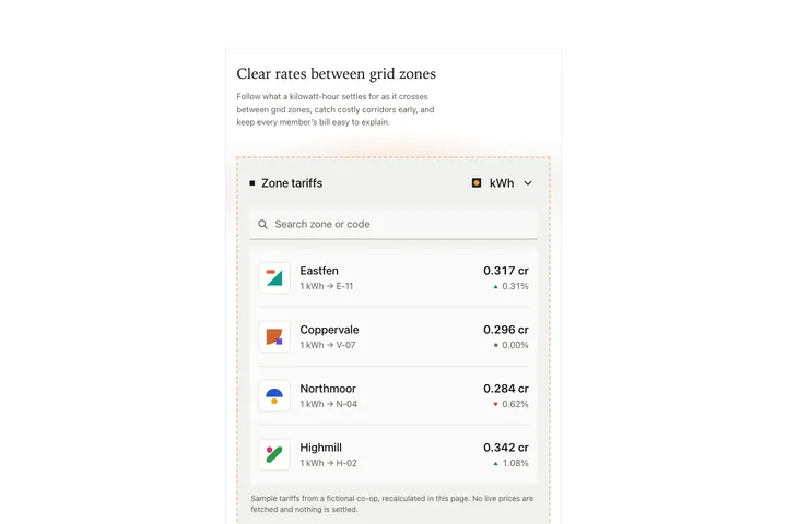
A feature card for a fictional energy co-op: a serif heading and a quiet description above an inset grey widget with a dashed warm frame, a square-bulleted title and a base-unit select, a square underlined search field and hairline rows of grid-zone tariffs, each with a rounded-square identity mark, a zone name over a conversion subline, and a value above a filled trend triangle and percentage; changing the unit recalculates every row locally and the search filters rows with an honest empty message.
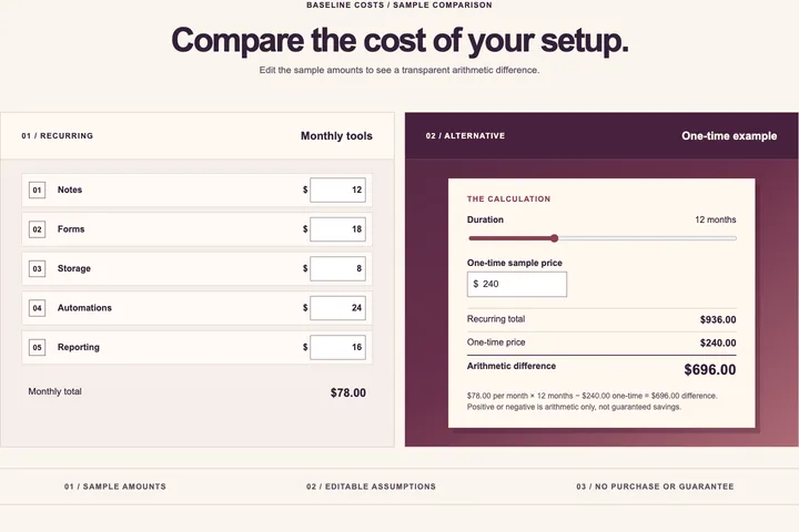
A local editable five-row cost comparison with exact arithmetic and neutral difference language.
AI builders guess when a prompt is vague. This UI design prompt generator writes out what a designer would specify: where every element sits, which element dominates, the realistic demo copy, the exact colour tokens with contrast checked, every interactive state and how the layout changes at 1440, 768 and 360 pixels.
Pick the builder and the implementation notes change with it. The v0 prompt asks for React, Tailwind CSS and shadcn/ui primitives. The Lovable prompt keeps the section inside a React and Vite app without a backend. The Cursor prompt tells the agent to read your codebase and follow its conventions first.
Every prompt asks for demo actions that stay local and say so, labelled inputs, visible focus and no horizontal overflow. The prompt is built from templates in your browser: nothing you type is sent anywhere and no AI model is called.