Free tool

CSS halftone generator

Build a halftone dot pattern for any background. Set the dot size, spacing, screen angle, color and fade, check it in the live preview, then copy a CSS halftone background or an inline SVG pattern for plain HTML or React.

Settings

6px
14px
45°
Layout
15%

Live preview

CSS gradient · 6px dots · 14px grid · 45°

Halftone backgroundDots, not pixels.
Output
Framework
index.html
<section class="halftone-host">
  <div class="halftone" aria-hidden="true"></div>
  <!-- Your content goes here -->
</section>
halftone.css
.halftone-host {
  position: relative;
  isolation: isolate;
  background: #f4efe6;
}

.halftone {
  position: absolute;
  inset: 0;
  z-index: -1;
  overflow: hidden;
  pointer-events: none;
  -webkit-mask-image: linear-gradient(to bottom, #000 15%, transparent 100%);
  mask-image: linear-gradient(to bottom, #000 15%, transparent 100%);
  container-type: size;
}

.halftone::before {
  content: "";
  position: absolute;
  top: 50%;
  left: 50%;
  width: calc(100cqw + 100cqh);
  aspect-ratio: 1;
  transform: translate(-50%, -50%) rotate(45deg);
  background-image: radial-gradient(circle at center, #1f3a5f 3px, transparent 3.5px);
  background-size: 14px 14px;
}

Halftone in context

See the halftone effect in a full component

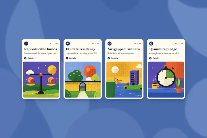
A dot pattern is one layer. These reviewed Dev.cards sections use halftone dots inside a complete layout, with full source for HTML/CSS/JS and React/TypeScript.

How it works

Halftone dots in CSS, explained

Everything the generator writes is plain CSS or SVG. No images, no canvas, no JavaScript at runtime.

A CSS halftone pattern is one repeating gradient

Each dot is a radial-gradient that is solid up to the dot radius and transparent half a pixel later. background-size sets the cell, so the browser tiles the dot into a grid. The extra half pixel keeps the edges smooth.

.halftone {
  background-image: radial-gradient(circle, #1f3a5f 3px, transparent 3.5px);
  background-size: 14px 14px;
  mask-image: linear-gradient(to bottom, #000 15%, transparent);
}

The halftone effect comes from the fade

Printed halftone fades by shrinking dots. In CSS, a mask-image gradient fades the pattern instead: the dots stay solid where the mask is black and disappear where it turns transparent. Choose a linear direction, or fade to the edges with a radial mask. "Solid until" sets how much of the area keeps full dots before the fade starts.

Rotating the screen angle

A gradient grid cannot rotate on its own, so for any angle other than 0° the dots move to a ::before layer that is rotated with transform. The layer is a square as wide as the host's width plus height, which covers the host at every angle. The mask stays on the parent, so the fade direction does not rotate with the dots. A 45° grid is the classic halftone look.

CSS halftone background or halftone SVG pattern?

  • CSS is the smallest output and is easy to theme with custom properties. Use it for section backgrounds and hero bands.
  • SVG uses a <pattern> with a gradient <mask>. It behaves consistently across engines and also works where you need markup, such as illustrations. The React version uses useId() so several instances on one page keep unique IDs.

Browser support

radial-gradient, mask-image and SVG patterns work in all current versions of Chrome, Edge, Firefox and Safari. The rotated CSS layer uses container query units (cqw, cqh), supported since 2023. The generated CSS also includes the -webkit-mask-image prefix for older Safari.